San Francisco Muni
Logo Redesign
Theoretical project re-imagining the famous Muni logo in the brutalist style.
Sketching + Vectoring
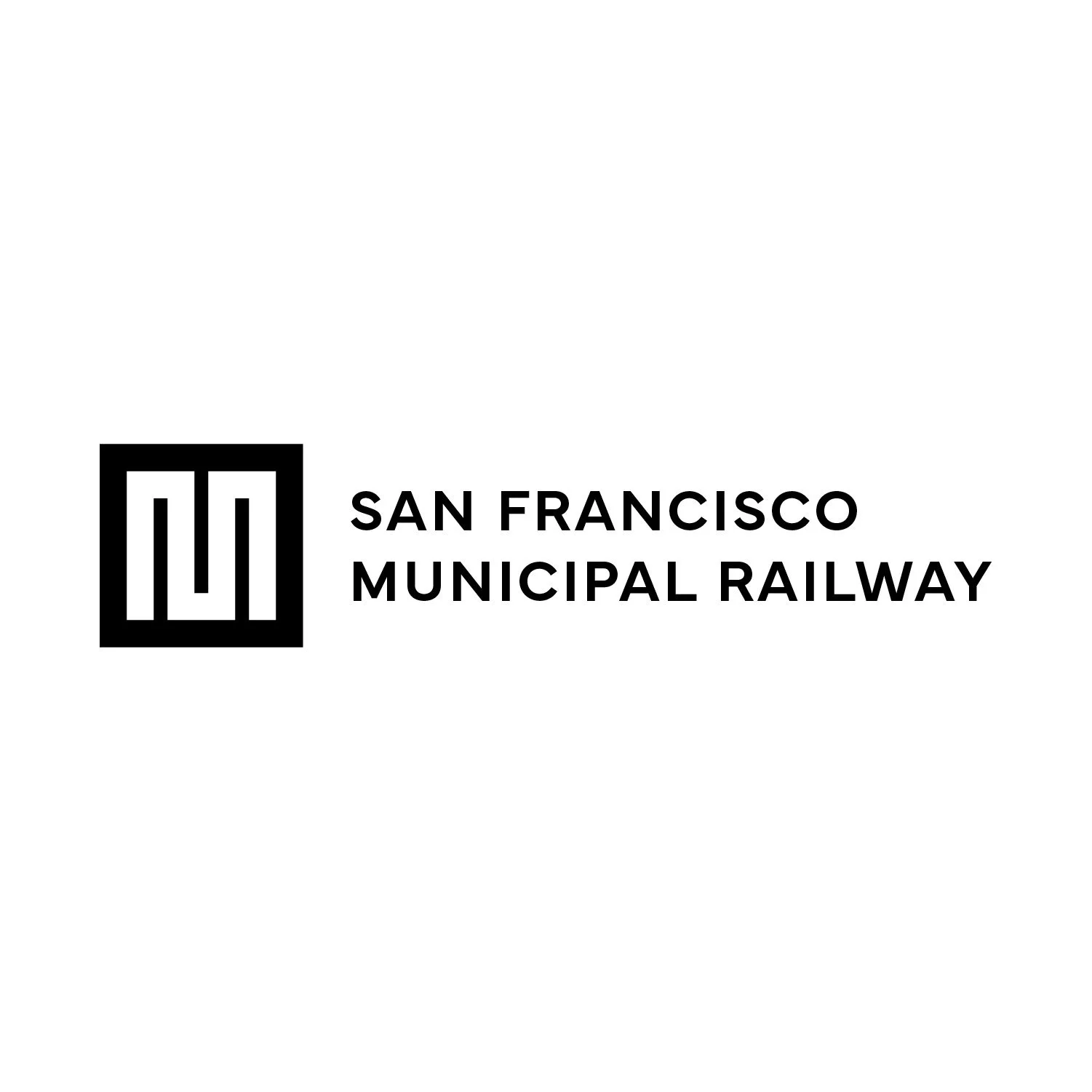
I knew that I wanted to work on a logo design for my project today, so I went back to the brief generator with logo design in the prompt. What it spit back out was “Design a logo for a public transit system in a Brutalist style.” I decided to try to redesign a logo for San Francisco’s Muni. The Muni already has such an iconic logo, so I didn’t want to stray too far from the original, while still tweaking it to fit into this new brief.
I started with some inspiration on Pinterest, making a quick mood board with various logos and icons that I felt fit into the Brutalist genre. From there, I wrote down some words that I associate with Muni, subways, and public transit. Once I had my inspiration and some mind mapping, I got to sketching some ideas.
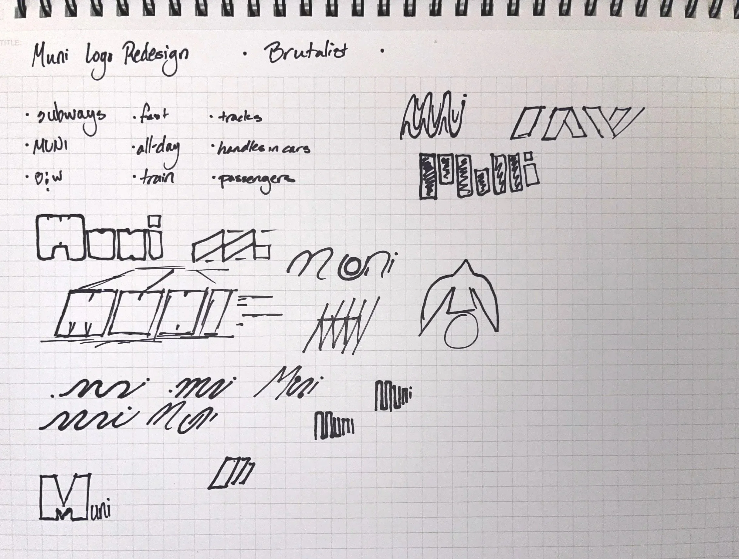
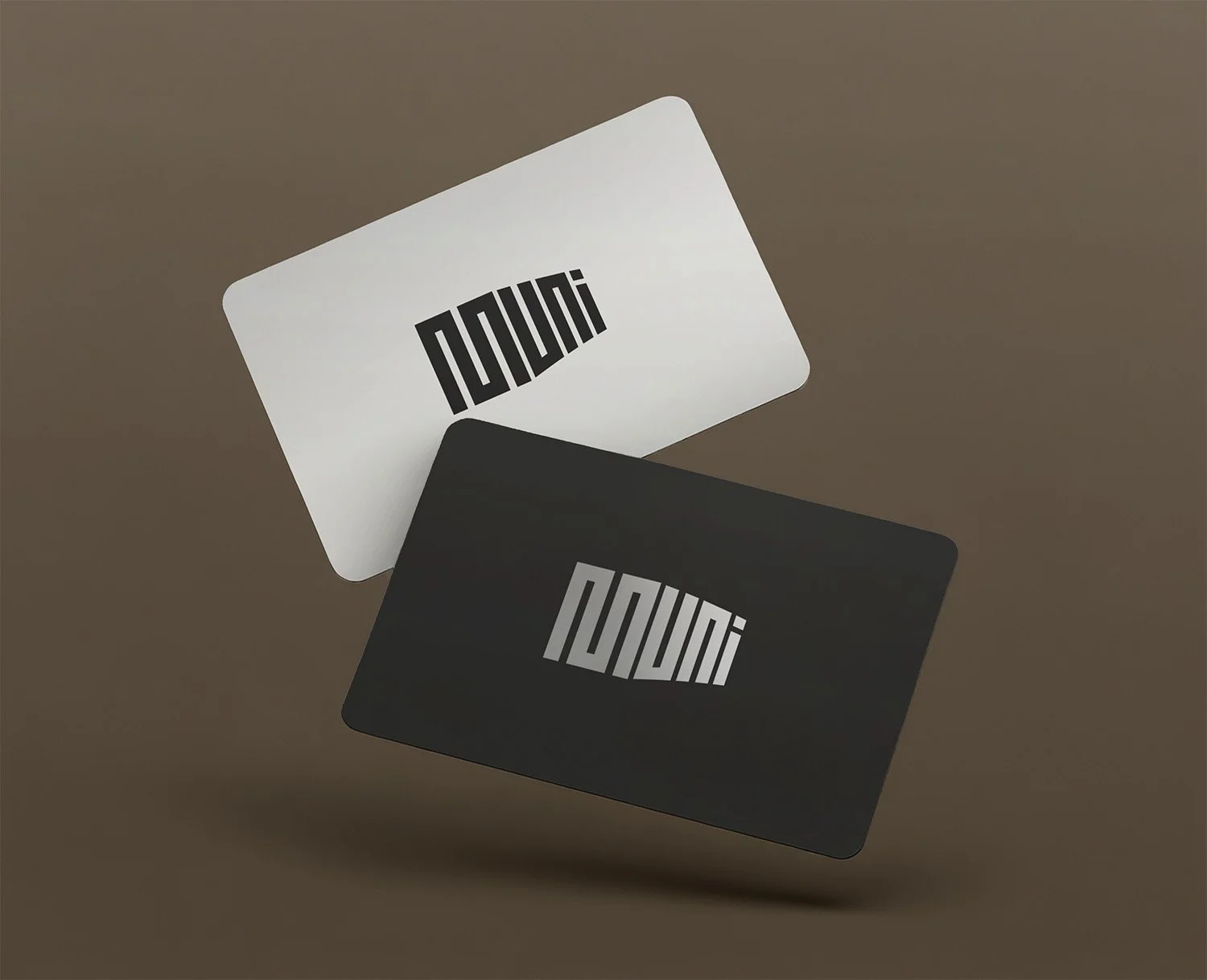
The sketch I decided to go forward with takes inspiration from the continuous nature of the original Muni logo, while making it a bit more squared-off and geometric. I thought it would be fun to make the letters evoke a subway car at a 45 degree angle, with the M being the front of the train. In addition to the primary logo, I created a secondary logo that uses the “M” of Muni as the icon paired with a sans-serif word mark.
I applied the final vector to some Muni passes, keeping them very minimal with high contrast, leaning into the brutalist nature of the brief.